An introduction to an exceptional residential design project
“Designing in the residential sector is such personal space, so it’s
lovely when our clients become our friends”
Residential design is a key segment within our business, but recently one individual project has inspired the whole team, in particular Caroline who is leading the project.
Gary and Caroline first engaged with Mel & Chris (our clients) at the end of last year and after a couple of visits to their home in Norfolk we were raring to get stuck in.
Built within a 2-acre walled garden with one side of the house providing stunning views over the neighbouring forest, Mel and Chris were looking for some help to design the interiors of their house and make it their dream home.
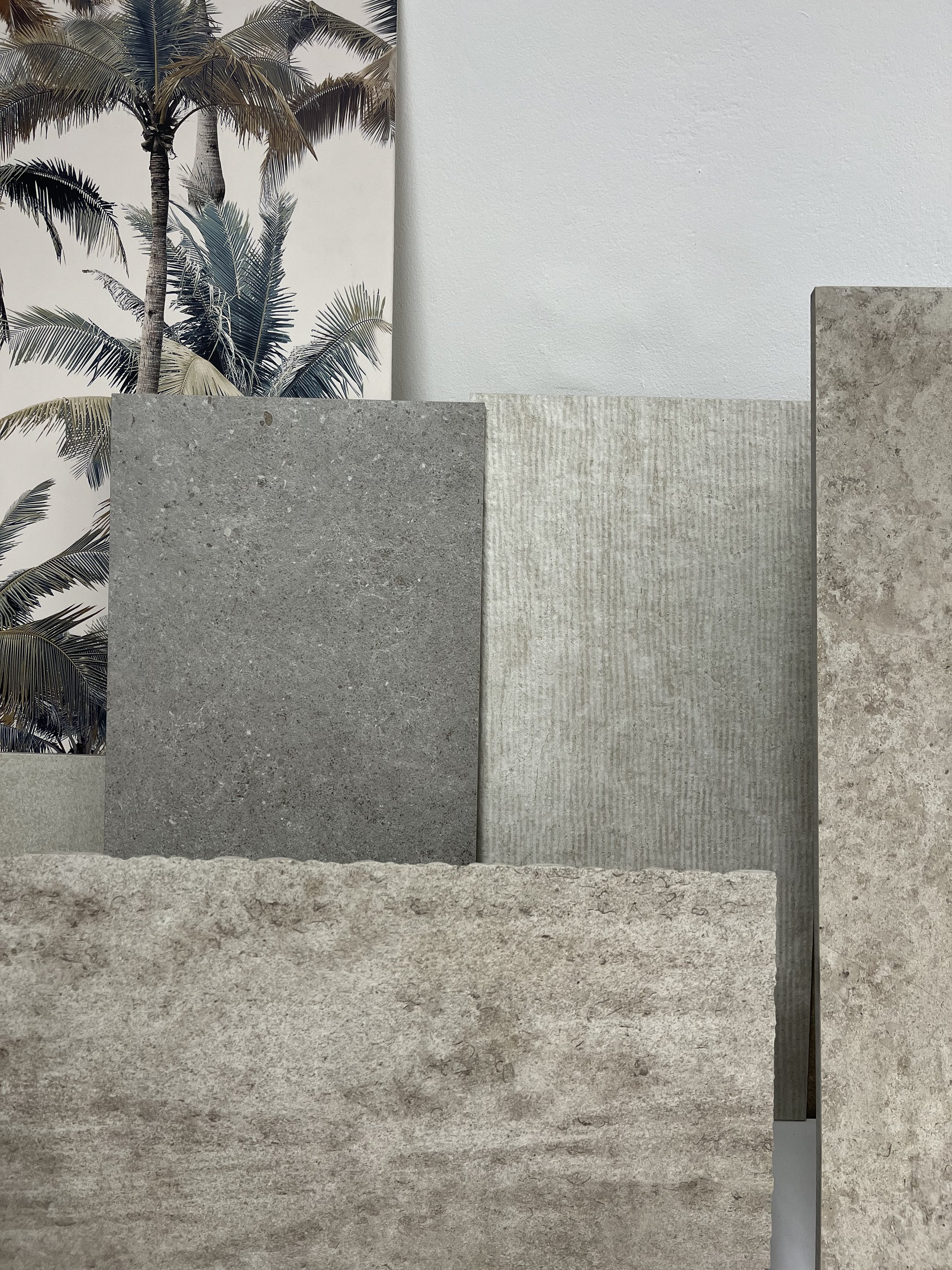
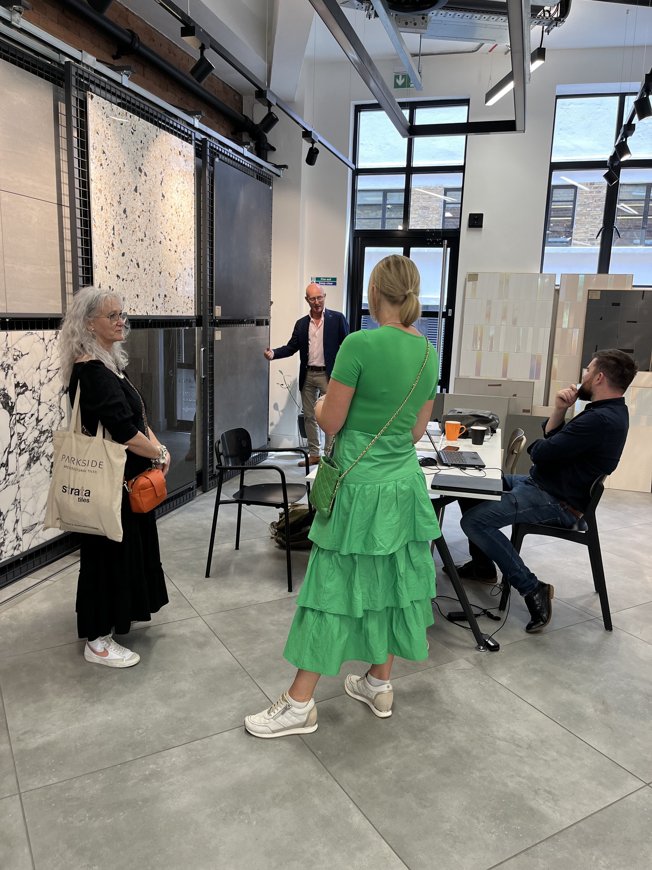
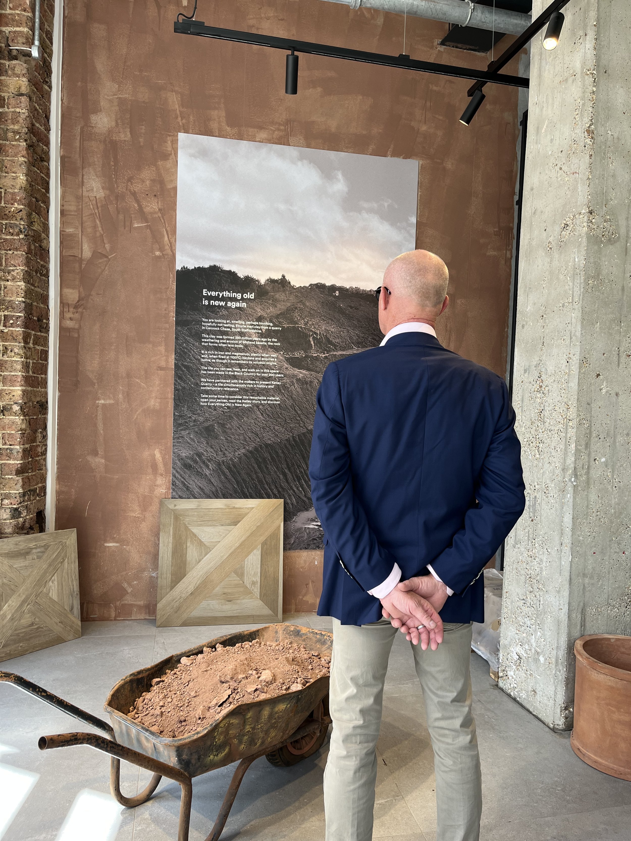
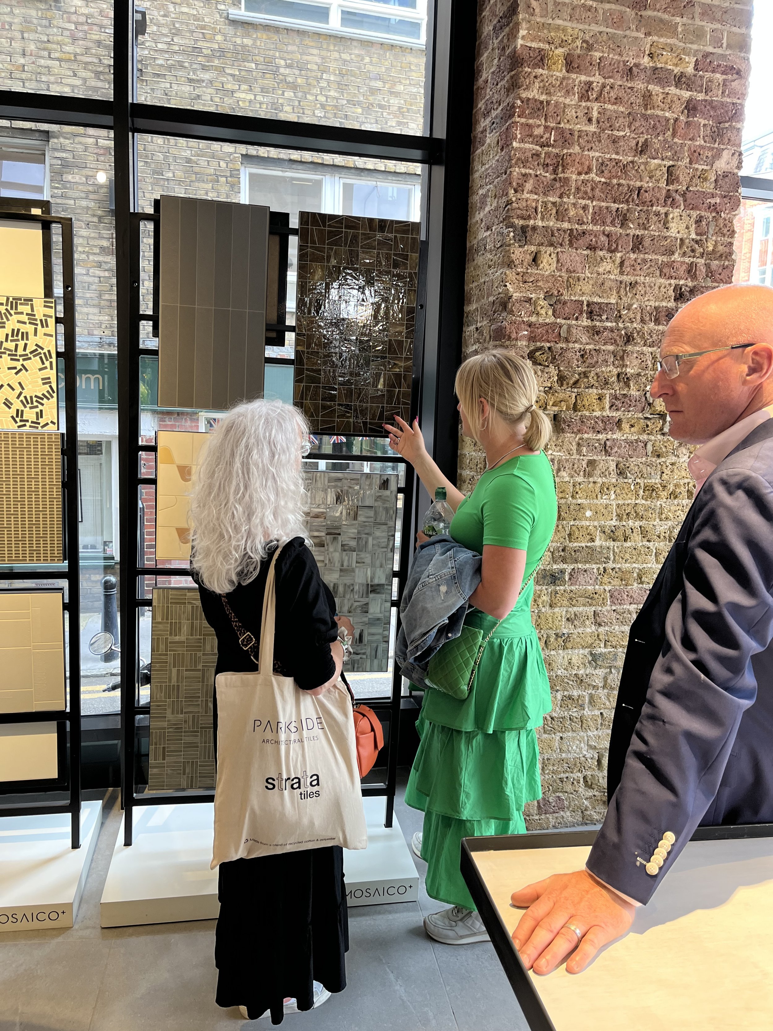
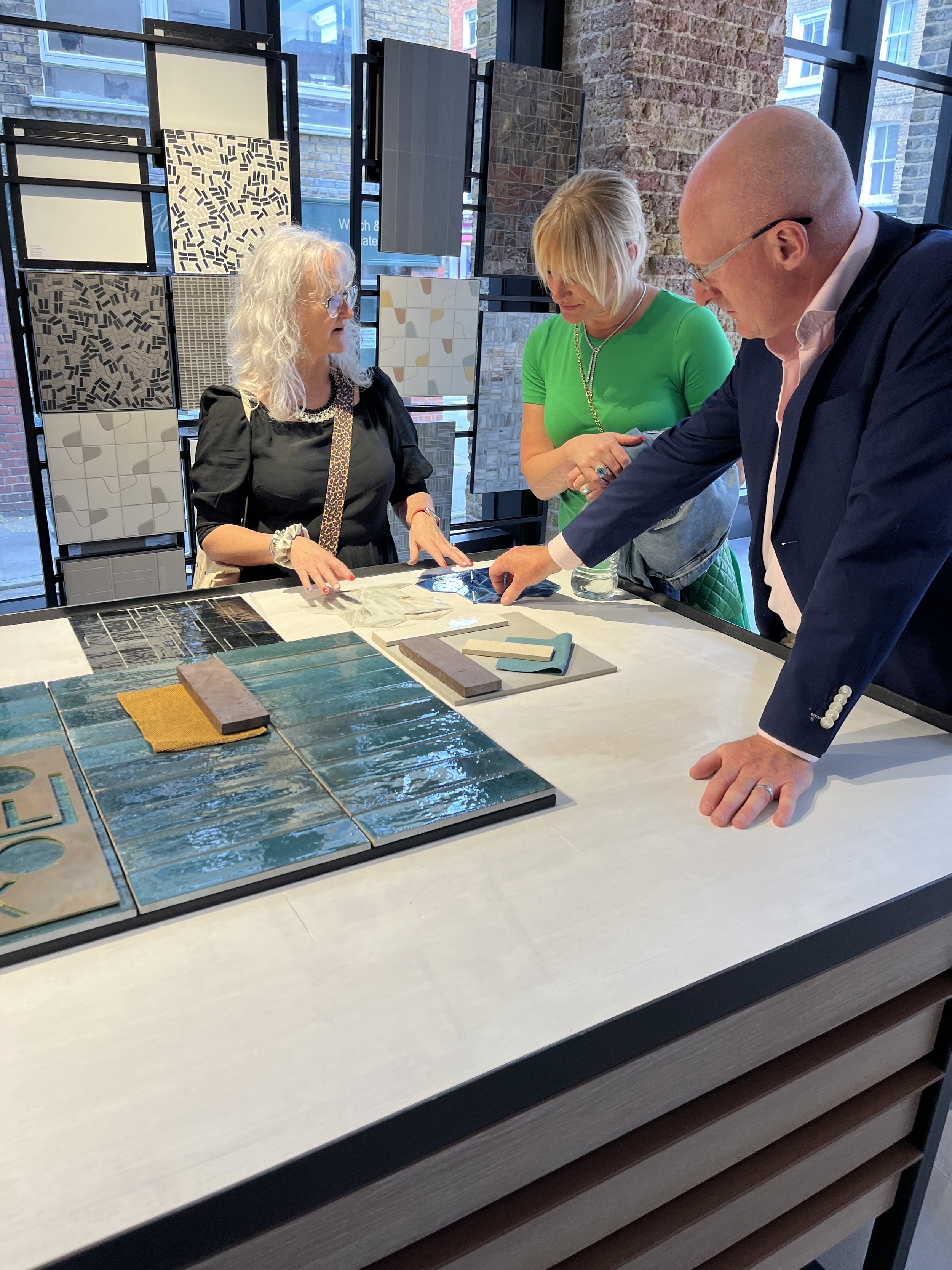
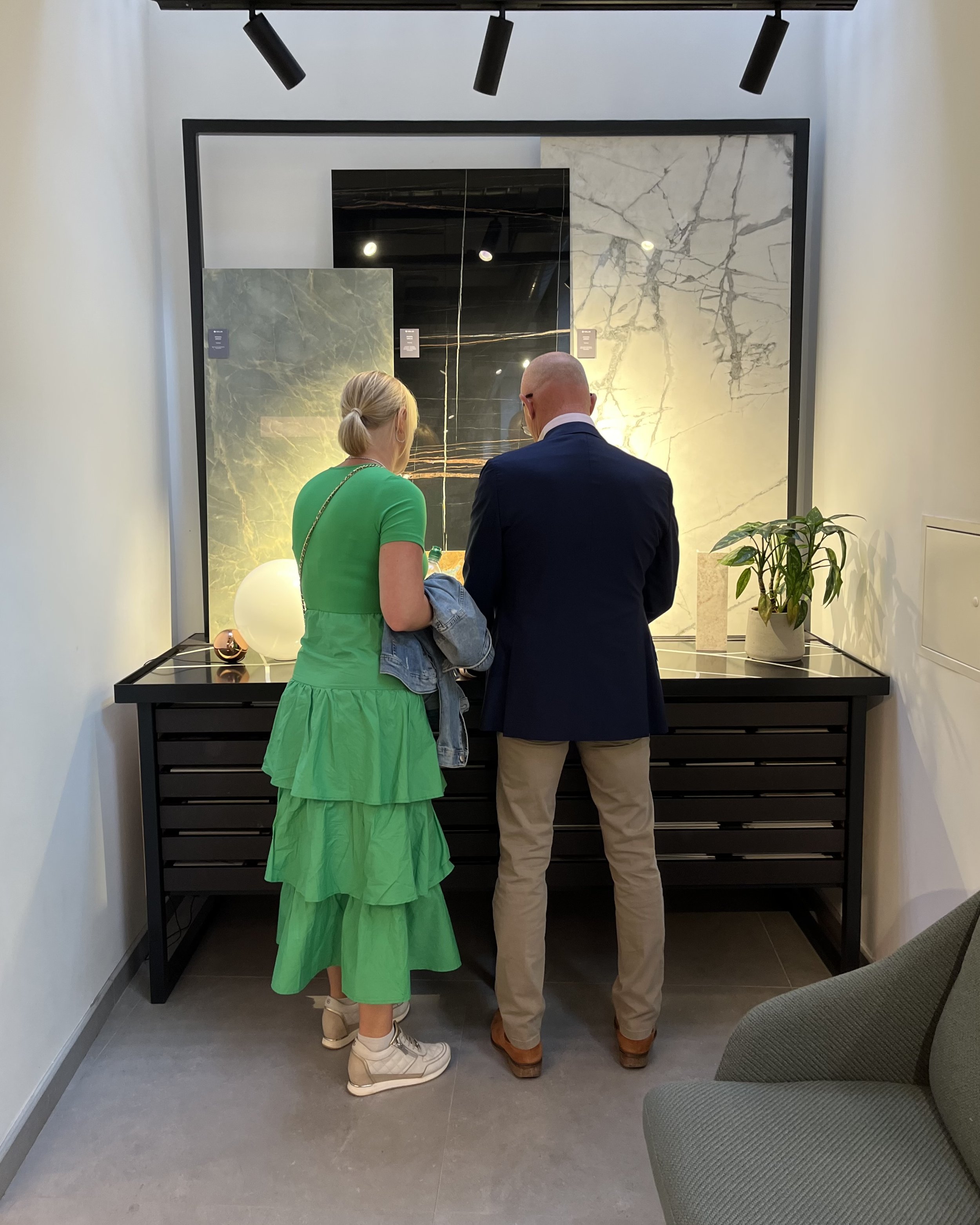
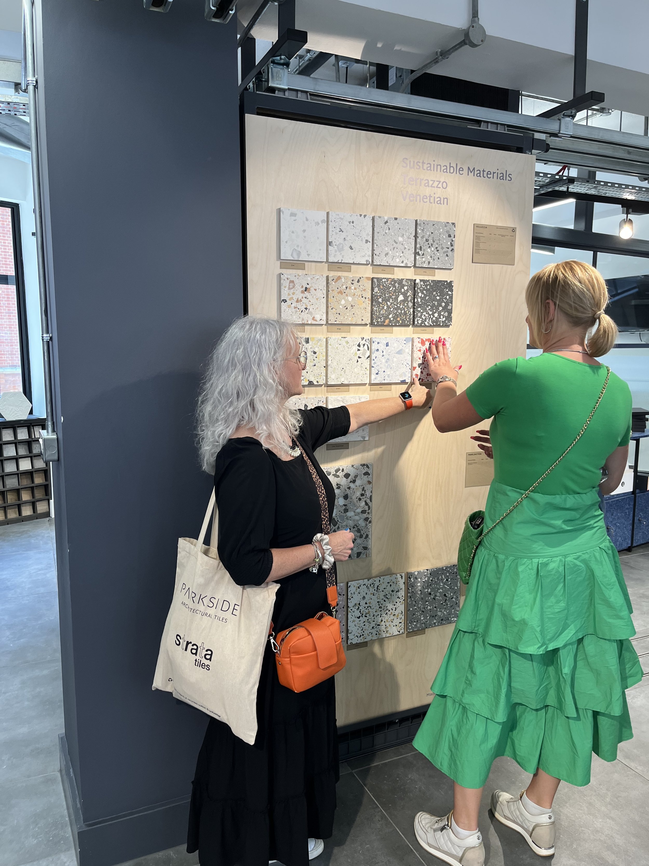
We recently spent a day with Mel & Chris, visiting the local showrooms to get a feel for what they love before finishing the day in the local pub where they kindly agreed to let us interview them about their experience so far. Here’s what they had to say:
Q: You got in contact with Tonik after staying in Middle Eight Hotel, what was it about that hotel that you particularly liked and inspired you to reach out to us?
A: As soon as we entered Middle Eight it was all the different textures and lux glamorous fabrics that drew us in.
We travel a lot so see a lot of hotels but Middle Eight hit the nail on the head for us. Being modern, luxurious, glamorous and sophisticated in style with some quirky bits as well.
Q: Was it more the public spaces or the bedrooms that you liked?
A: More in the public spaces but we love the bedrooms as well. I can’t think of anything in the hotel that I don’t like.
We went away after our stay at Middle Eight and I continued to look at different ideas before eventually approaching a Norfolk based Interior Designer and discovering we needed to look further afield.
Q: In your line of work you cover an element of house design so why did you decide to reach out to a designer and not do it yourself?
A: We have our own architectural design practice and cover everything from large family homes to multi-use housing developments but the planning and layout of a house is completely different to the dressing of it. Whilst we can get the spaces to work and flow and make best use of space, when it comes to textures, lighting and the interior detailing that’s a completely different game.
Also we wanted something that was going to push the boundaries a bit in terms of design – we didn’t want “normal for Norfolk”.
Q: Tell us about “normal for Norfolk”?
A: There’s a Norfolk look, and it’s nice but it’s so done and everyone knows it. Whilst that’s great if you have a holiday home, it’s not what we want for our house design. We’re talking duck egg and eau de nil, Laura Ashley and a bit of drift wood thrown in. Which was great in its day but things move so slowly in Norfolk. That’s why people love it because it is slow, but so is everything in it and the pace of change hasn’t caught up.
Because we travel so much and most of the inspiration we have in home is from our travels.
Q: What in particular in your home has been inspired by your travels?
A: In our current home we have an Oyster Bar style of unit, which has been inspired by the Langham in Australia – we’ve spent a lot of time there.
We’ve picked up a lot of inspiration from Japan. In Japan they often have a bathroom with a door either side of a bedhead, so you can literally fall out of bed and roll straight into the bathroom. In America they separate the toilet so it has it’s own door within the bathroom itself. So all of our toilets are enclosed. Both of these are features that have been incorporated into our house design.
We wanted to go up-spec in terms of the detailing and lighting because it’s our own home, it’s so personal and we want it to be the best, for example the large doors that are going to be custom made.
For us it’s about stepping up in terms of what we know.
Your own home is probably the most expensive item you will ever buy so we wanted to put our trust into the hands of a professional.
Q: So what happened when you first got in contact with us?
A: We picked up the phone and spoke to Gary, who jumped in his car and came and visited us from Eastbourne, we knew straight away that he wasn’t going to mess us around and we trusted him.
To engage in an interior designer is an extreme luxury however we do believe we will be able to achieve a huge amount of betterment by working with Tonik and create our dream home.
It was a brave step for us but already it’s paying off and we have since recommended Tonik to two of our clients for their multi-million pound homes.
Q: What’s been the biggest surprise that Tonik have brought to the table?
A: The cube kitchen as we like to call it was a great idea from Caroline and Gary.
Q: you changed the kitchen location didn’t you? Why was this?
Caroline A: as soon as we visited Mel and Chris’s home to look deeper into the existing layout, we identified that the kitchen and dining area alone was bigger than most peoples’ homes. So, we had to look differently at how we could make it a family home without just filling the spaces with furniture.
Not only is it a huge space but also has views one side over the beautiful 2-acre walled garden, and on the other the actual wall of the garden, and we wanted to somehow maximise both.
By visiting the space, we identified that we needed to completely ignore the plans and look at this space from scratch – the result being that all the amenities and storage of a kitchen are now hidden in a cube in the centre of the house, allowing us to make the most of the wall and the views whilst still creating a comfortable family living space.
It’s always lovely when our clients are open to our ideas, especially when the benefits are positive.
Q: What other design features do you particularly love?
A: In our original plans my dressing room was on the opposite wall to the bathroom whereas Chris’s was right next-door – Caroline had the idea to swap them over which meant that my dressing room would lead directly into the bathroom.
Also when Gary visited he stood on the landing and identified that our lighting ideas would block the views and we needed to make some changes to have a light fitting that would frame the views instead.
Had we not worked with Tonik we would have ended up with a lighting design that blocked one of the main features of the home.
Q: we all know that Caroline has a strong view on the colour of front doors, so what colour will your front door be?
A: We have three doors leading to our home; first you enter through the door that’s within the garden walls, it’s like a secret garden door.
Then you have the main door, which leads to the pivot door to the main space.
We haven’t decided on the colour yet but there have been talks of red or orange leather…
Caroline: our plan is to make a statement… Why wouldn’t we!

